How can we help?
Using the different views of actions from a folder (List, Gantt, Kanban)
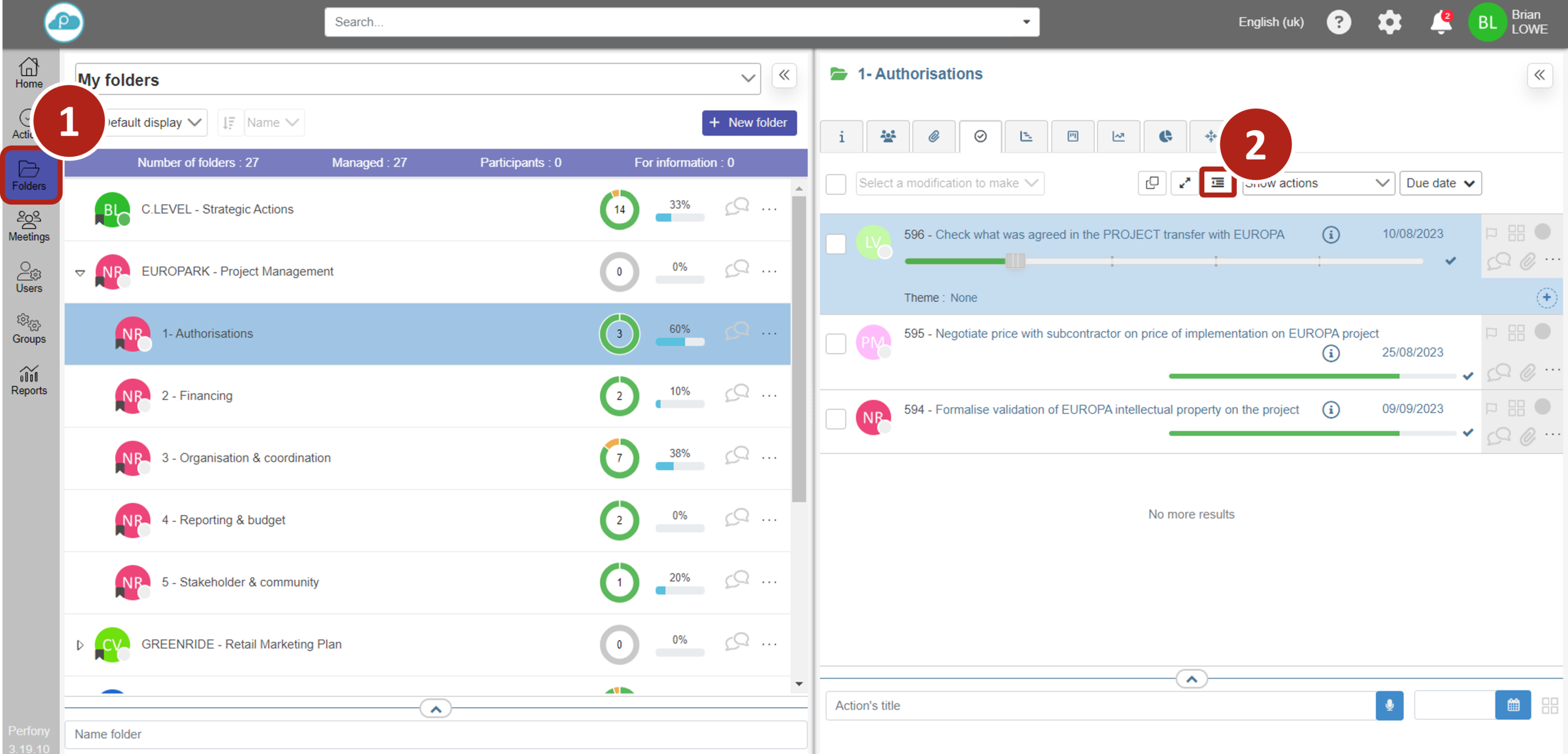
To satisfy every need, it is possible to view the actions of a folder in different ways. Access your folders from the left-hand menu. Choose a folder from the list of folders by clicking on it.
The 3 types of display: List, Gantt, Kanban are tabs in the second pane on the right.
- List view
- Gantt view
- Kanban view
The “List” view
This is the default and most well-known view of the actions. They appear one below the other according to criteria, filters and sorts that you will have determined.
You can choose to show or hide the sub-actions in the action plans in list view (see image below).

In order to display more actions on the same page, it is also possible to use the compact or unfolded view to display more details, by clicking on the icon as below. Successive clicks on this button will display the actions in compact, folded or unfolded list mode. Compact mode displays the largest number of actions, while unfolded mode displays all the custom fields for all the actions.

In folder view, a chained action is symbolized by the following icon
and when you click on this picto, you return to the Gantt view (to change the deadline for example).
The Gantt view.

This view allows you to have an overview of your file (project or service for example) thanks to the different filters (Day, week, month, quarter, year).
It is accessible for all the action plans of the folders thanks to the “GANTT” tab at the top right of the double page of the folders.
The link symbolizes the chaining of an action. If you want to delete a chain, simply double-click on the line.
Please note that to be relevant, the Gantt view requires the start date and due date to be entered, otherwise the dependencies between the actions will not appear relevant.
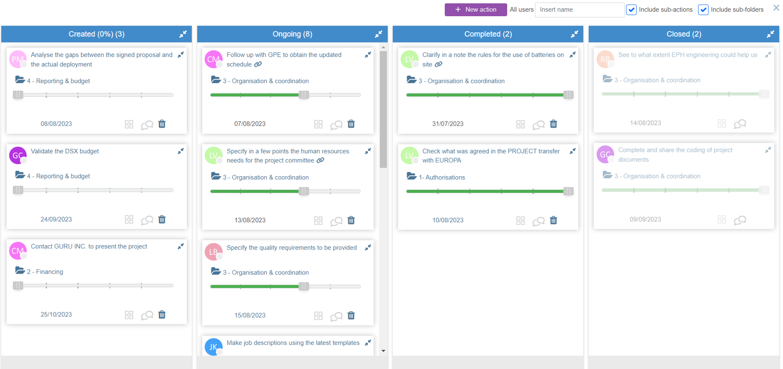
The “Kanban” view

The Kanban view of Perfony is accessible :
- For your general action plan via the menu “My Actions” and then “Kanban View”.
- For all the action plans of the folders via the “Kanban” tab in the top right-hand corner of the double page of the folders.
In the kanban view, you can advance your actions represented as a post-it by simply clicking and dragging from one column to the next. This is a very intuitive view to bring action plans to life.
Clicking on the name of an action will take you to the action form.
The Burn Up chart view
This view will allow you to see how the actual project is progressing compared with the planned project.
It can be accessed via the Burn Up chart tab in the top right-hand corner of the folders double page.
The blue curve represents the actual project progress figures and the red curve represents the estimated figures for this project.
